Mong9 Editor:: Mode Window
Mong9 Editor offers a mobile-friendly mode window, allowing you to complete a clean and stylish design on your mobile screen.
So, reactive web refers to automatically changing the size of a webpage depending on the type of device such as PC, tablet PC, mobile, etc.
It’s a design that reacts to devices that connect to the Web.
Not long ago, when we created a website, we created a site that was tailored to the characteristics of the mobile site and the PC.
Recently, the trend has changed with reactive web design.
Reactive web design is a way to display websites in a variety of screen sizes.
Redesigns to fit the screen size and change the display of each element according to the device to implement the site.
Mong9 Editor also offers a resolution mode design tailored to the reactive web.
PC screen, mobile landscape view, and mobile portrait screen are provided so that you can consider the screen for each device as you edit.
If you don’t like the configuration created automatically, you can modify it to mobile editing mode.
So, let’s take a look at each screen and sort it out.
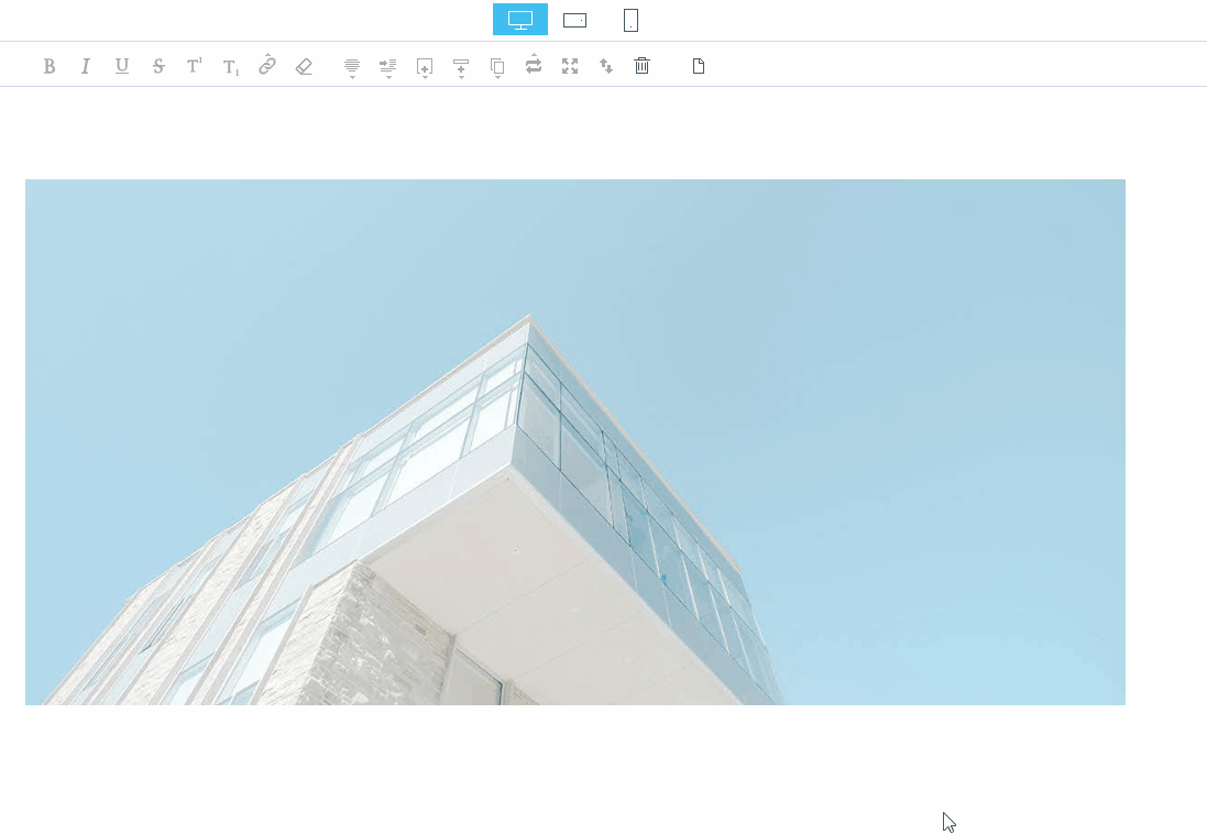
The size of the image depends on the type of device. The size of the image will respond according to the device.
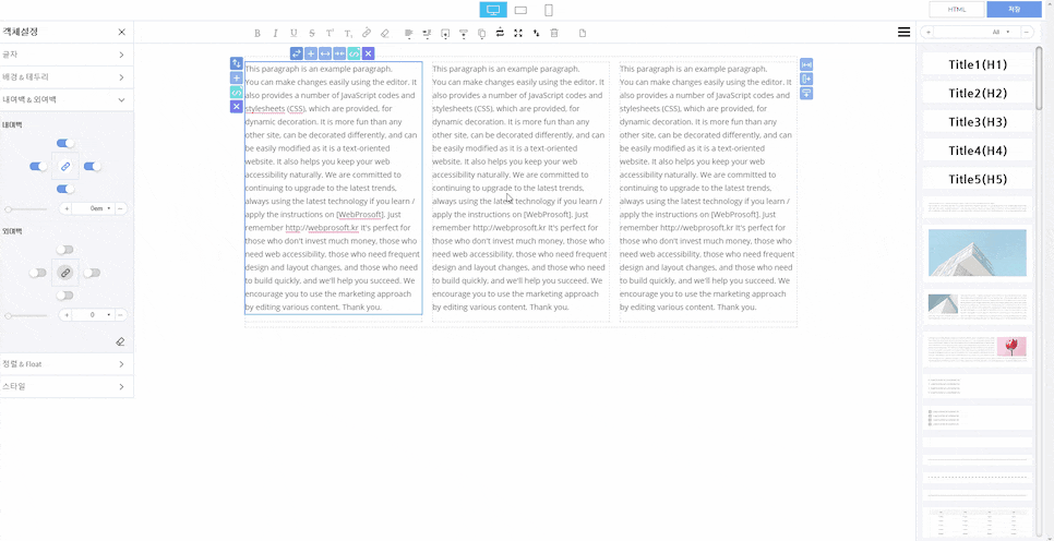
| Output method according to screen
First, the output method, according to the PC screen. It comes in basic mode.
You can edit photos, edit articles, and layouts on a PC screen.
Second, you can see how the editing screen will be printed when the mobile is laid horizontally.
You can see that the width of the screen is smaller than the PC screen.
Finally, you can see how the editing screen will be printed on the mobile portrait screen.
Assuming that the objects are placed side by side on the horizontal screen because the desktop is a long horizontal screen, mobile is a long, long screen, so if you have three objects on the horizontal screen, you’re too uncomfortable to read.
Taking this into account, Mong9 Editor created a reactive design that best embodies each object on a portrait screen.
If you want to reduce the size only on the mobile because it’s designed to be full of widths, you can go into the mobile mode and edit it.
| Directly specify screen segmentation
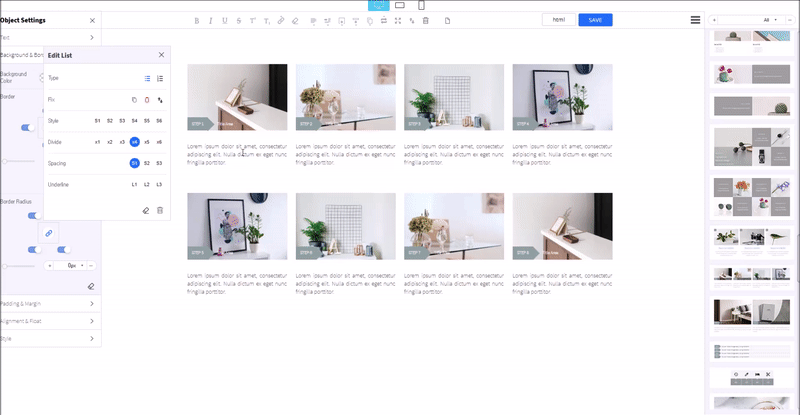
Meanwhile, in mode setting, the “Divide” function of the “Edit List” allows you to determine the screen segmentation for each device.
| Column alignment function
The column alignment button is only available in mobile mode.
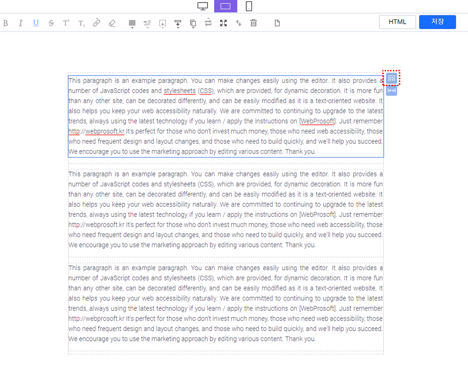
First, switch the mode window for reactive mode processing.
I switched to the mobile landscape mode.
And when you click on the block, do you see the square boxed in red like the above screen?
Pressing that button activates the column alignment function!
The Mong9 Editor’s “Column Alignment” button can adjust the shape of the split by mode when each object in a block is divided into columns.
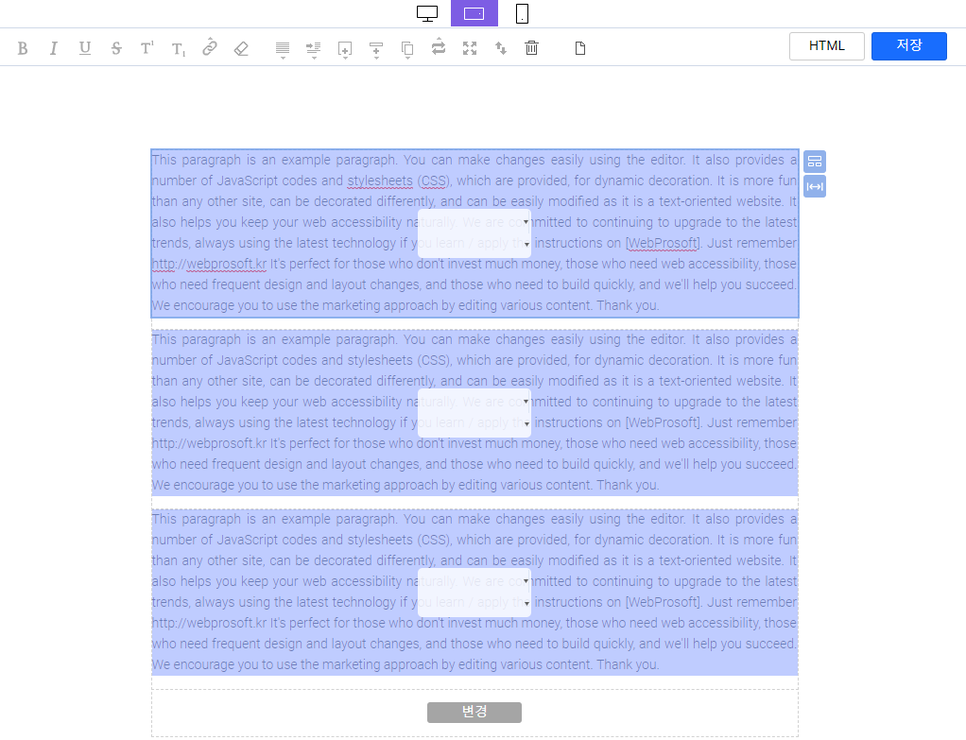
This default sort of column can be customized.
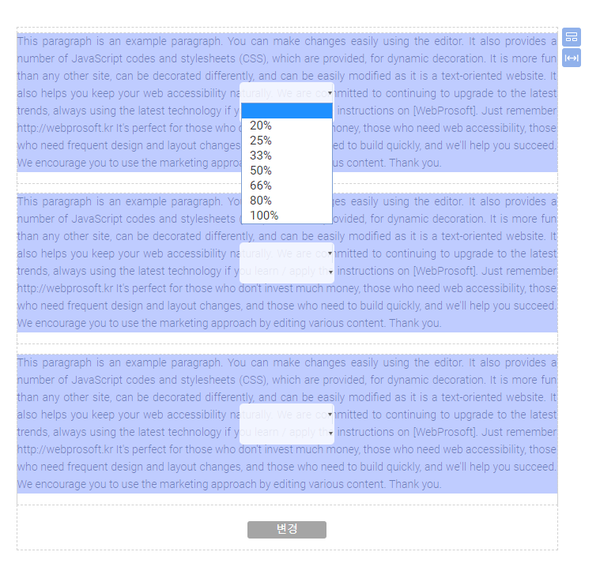
First, press the ▼ button to specify the percentage width for each object.
I’ll designate 33% here.
(If we assume that there are three objects in a block, that’s 33%, right?)
The remaining two objects are similarly specified at 33%.
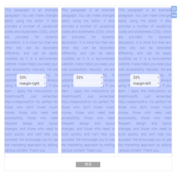
Three objects are seated in the width of the street.
You can see that the layout has changed from the original 100% width to the 33% layout.
Just like horizontal mode, the mobile vertical mode is the same as horizontal mode, and as you change it to the desired shape, the column alignment by mode is complete.
You specify a width of 33% for each object.
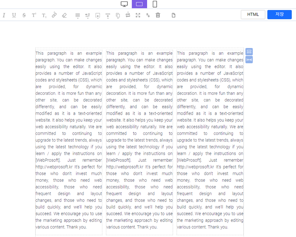
Each object has a width of 50%, 50%, and 100%.
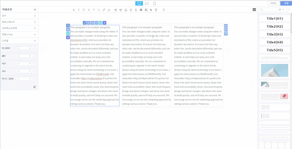
Convert the width of objects by mode, which may seem complicated, but it is not difficult with the Mong9 Editor.
As you can see, you can decorate your own content beautifully in the Mong9 Editor.
This article was written in Mong9 Editor.
Click the link below to download Mong9 Editor.